

Is Your Site Stuck in 2010? 7 Fatal Signs Your Website Design Looks Outdated
Imagine walking into a high-end store, but the floor is dusty, the lights are flickering, and the music is playing from a cassette tape. You probably wouldn’t feel very confident buying anything there. Your website is no different. It is your digital storefront. If it feels like it hasn’t been touched since 2010, your visitors will think your business is out of touch too.
First impressions happen in about 0.05 seconds. That is all the time you have to prove you are professional and trustworthy. If you are struggling with low sales, you need to look at the signs your website design looks outdated. Usually, it isn’t just one thing—it’s a collection of small details that make your site feel like a relic of the past. Let’s look at the real red flags.
Quick Comparison: Outdated vs. Modern Design
Before we dive into the details, here is a quick overview of how a 2026 website should look compared to an old one.
| The Feature | Outdated Design (The Red Flag) | Modern Design (The 2026 Standard) |
| Mobile Experience | Hard to read, tiny buttons, needs zooming. | Fully responsive, thumb-friendly layout. |
| Typography | Small fonts (12px) and clashing styles. | Large, readable fonts (16px+) and clean hierarchy. |
| Images | Cheesy, low-resolution stock photos. | Authentic, high-quality, lifestyle photography. |
| Layout | Boxy, cluttered, and full of sidebars. | Clean, spacious, and use of white space. |
| Speed | Takes forever to load heavy elements. | Near-instant loading (thanks to Hostinger). |
1. It’s Not Mobile Responsive
This is the biggest of all signs your website design looks outdated. In 2026, if a visitor has to “pinch and zoom” to read your text on a phone, they are leaving. Google now practices mobile-first indexing, meaning if your mobile site is bad, you simply won’t rank. An old-fashioned “desktop-only” layout is a death sentence for your business.
2. You Are Still Using a “Sidebar” Heavy Layout
Back in the day, every blog had a giant sidebar full of tags, categories, and ads. Today, sidebars are mostly dead. They distract the user and look cluttered on modern screens. One of the clearest signs your website design looks outdated is a layout that feels cramped and busy instead of clean and focused.
3. Your Fonts Are Tiny and Hard to Read
Old websites loved small text. But as screens have gotten higher in resolution, those small fonts have become impossible to read. If you are using 12px or 14px for your main body text, you are hurting your visitors’ eyes. Modern web design is about “Readability.” Large, bold typography is the new standard.
4. Cheesy, “Fake” Stock Photos
We’ve all seen them: the photos of people in suits shaking hands while smiling too hard in a bright white room. These photos feel fake, and customers can see right through them. Using these generic images is one of the classic signs your website design looks outdated. People want to see real people, real offices, and real products.
5. Your Website is Painfully Slow
Speed is a design element. If your site has heavy animations, unoptimized videos, or is running on a weak server, it feels old and clunky. If you are wondering signs your website design looks outdated, check your load time. A fast site feels premium; a slow site feels broken.
The Fix: You need a high-performance host. I personally recommend Hostinger. Their LiteSpeed technology ensures your site is snappy and modern, which is essential for user trust.
6. No Clear Value Proposition (The “Hero” Section)
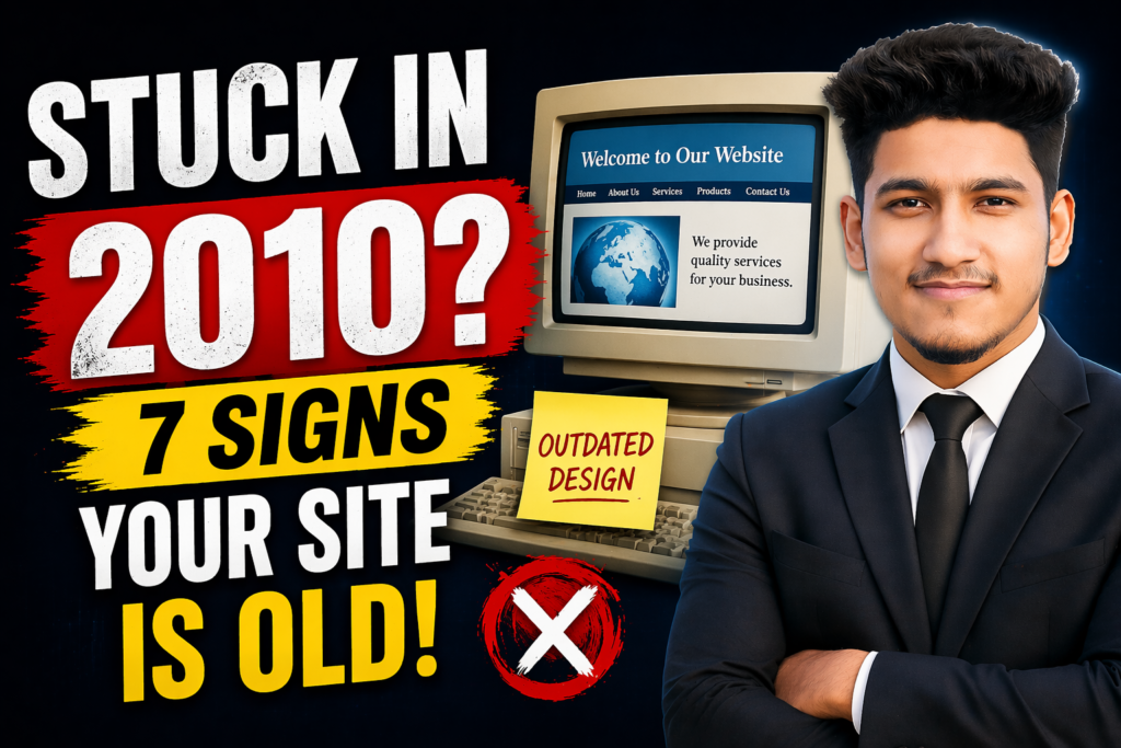
When I land on your site, I should know exactly what you do within 3 seconds. Outdated sites often start with a generic “Welcome to our website” message. Modern sites start with a “Hook”—a clear headline that tells me how you solve my problem. A vague homepage is one of the major signs your website design looks outdated.
7. You Aren’t Using White Space
Old-school design tried to cram as much information as possible into the top half of the page. This creates “visual noise.” Modern design uses white space (empty space) to let the content breathe. If your site looks like a crowded newspaper, it’s one of the definite signs your website design looks outdated.
Let’s Modernize Your Brand Together
You don’t need a million-dollar budget to fix an outdated site. Often, just changing your fonts, cleaning up your layout, and optimizing your images can make a massive difference.
If you want to see how I transform old, clunky websites into modern, high-converting tools, feel free to follow me on Instagram @the_sahebali.
Is your site scaring away potential clients? If you want a professional audit to check the signs your website design looks outdated, or if you need a fresh, 2026-ready WordPress site, let’s talk. Reach out to me on WhatsApp at +880 1782-370787. I’ll help you look as professional as you actually are!
Conclusion
Design trends change, but the goal remains the same: to build trust and make sales. If your website shows these signs your website design looks outdated, it’s time for an upgrade. Don’t let your brand get left behind in the past. Take the first step today by cleaning up your homepage and speeding up your server.