

Unlock More Traffic: How to Make a Mobile-Friendly Website Easily (2026 Guide)
Think about the last time you tried to open a website on your phone and had to pinch the screen just to read a sentence. Frustrating, right? You probably closed that tab within seconds. This is exactly what your customers do when your site isn’t optimized for their devices.
In a world where over 60% of web traffic comes from mobile phones, knowing how to make a mobile-friendly website easily is no longer a luxury—it’s a survival skill for your business. If your site doesn’t work perfectly on a smartphone, Google will simply stop showing it to people.
Why Mobile-First is a Big Deal
Google doesn’t look at your desktop site first anymore. They practice “Mobile-First Indexing.” This means the mobile version of your site is the starting point for what Google includes in their index. If you want to rank on the first page, you have to prioritize the mobile experience. When you learn how to make a mobile-friendly website easily, you aren’t just helping your users; you are making Google happy too.
Quick Comparison: Mobile-Friendly vs. Mobile-Awful
To help you understand what to aim for, here is a simple breakdown of the critical differences:
| Feature | Mobile-Friendly (The Goal) | Mobile-Awful (The Business Killer) |
| Navigation | Simple “Hamburger” menu. | Too many links that are hard to click. |
| Images | Scale automatically to fit the screen. | Images are cut off or too wide. |
| Buttons | Large and easy to tap with a thumb. | Tiny buttons that require “pinching.” |
| Text Size | Readable without zooming in. | Microscopic fonts that cause eye strain. |
| Load Speed | Loads in under 3 seconds. | Takes forever to load heavy files. |
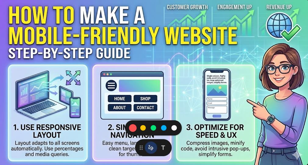
1. Use a Responsive Framework
The most effective way to how to make a mobile-friendly website easily is to use a responsive design. Instead of building a separate “mobile site,” a responsive design uses a single layout that automatically “stretches” or “shrinks” to fit any screen size—whether it’s a giant 4K monitor or a small iPhone.
If you use WordPress, picking a theme like Astra or GeneratePress makes this automatic. These themes are built to be responsive out of the box, saving you hours of coding work.
2. The “Thumb Test” for Buttons
When people use a phone, they use their thumbs. If your buttons are too small or placed too close together, users will accidentally click the wrong thing. This is a massive turn-off.
To how to make a mobile-friendly website easily, ensure your buttons are at least 44×44 pixels. Give them plenty of “breathing room” (white space) so that even someone with large hands can navigate your site without getting frustrated.
3. Optimize Your Typography
Reading on a small screen is harder than reading on a desktop. If your font is too thin or too small, people won’t stay. Stick to a minimum font size of 16px for body text. Also, use high contrast—black text on a white background is the gold standard for readability. Avoid fancy, decorative fonts for your main content; they might look “cool,” but they are often a nightmare for mobile users.
4. Simplify Your Menus
On a desktop, you might have a massive menu with 10 different categories. On a mobile phone, that takes up the whole screen. To how to make a mobile-friendly website easily, use a “hamburger menu” (those three horizontal lines). This keeps your site looking clean and professional while still giving users access to your main pages when they need them.
5. Kill the Pop-ups
Nothing ruins a mobile experience faster than a giant pop-up that covers the entire screen and has a tiny “X” that is impossible to click. Google actually penalizes sites that use “intrusive interstitials” on mobile. If you must use a pop-up, make sure it only covers a small portion of the screen or only appears when the user is about to leave.
6. Speed is a Critical Factor
Mobile users are often on the go, using 4G or 5G connections that aren’t always stable. If your site is “heavy” with massive images and slow scripts, it won’t load. To truly how to make a mobile-friendly website easily, you must optimize your images. Use the WebP format and a caching plugin to make sure your pages pop up instantly.
Final Thoughts
Making your website mobile-friendly isn’t a one-time task; it’s about constant improvement. Open your site on your own phone right now. Is it easy to read? Can you click the buttons? If the answer is no, then you have work to do.
By following these simple steps on how to make a mobile-friendly website easily, you will protect your business from losing valuable traffic. A fast, responsive, and easy-to-use mobile site is the best gift you can give your visitors—and your bottom line.